Inflight Entertainment Redesign
Air New Zealand · Lead Designer · 2 years (ongoing) · 0 - 1 Project
OVERVIEW
A new era of inflight experience
With the introduction of new widebody aircraft, Air New Zealand had the opportunity to rethink more than its inflight entertainment system.
The project evolved into a connected onboard ecosystem — spanning the seatback experience, passenger web apps, Bluetooth pairing, inflight Wi-Fi, and cross-device interactions.
Working across vendor constraints, new hardware capabilities, and compressed timelines, the challenge became designing a system passengers could comfortably live with for long-haul travel.
ROLE
My Role: Lead Product Designer
Scope: Core IFE + 5 connected web apps
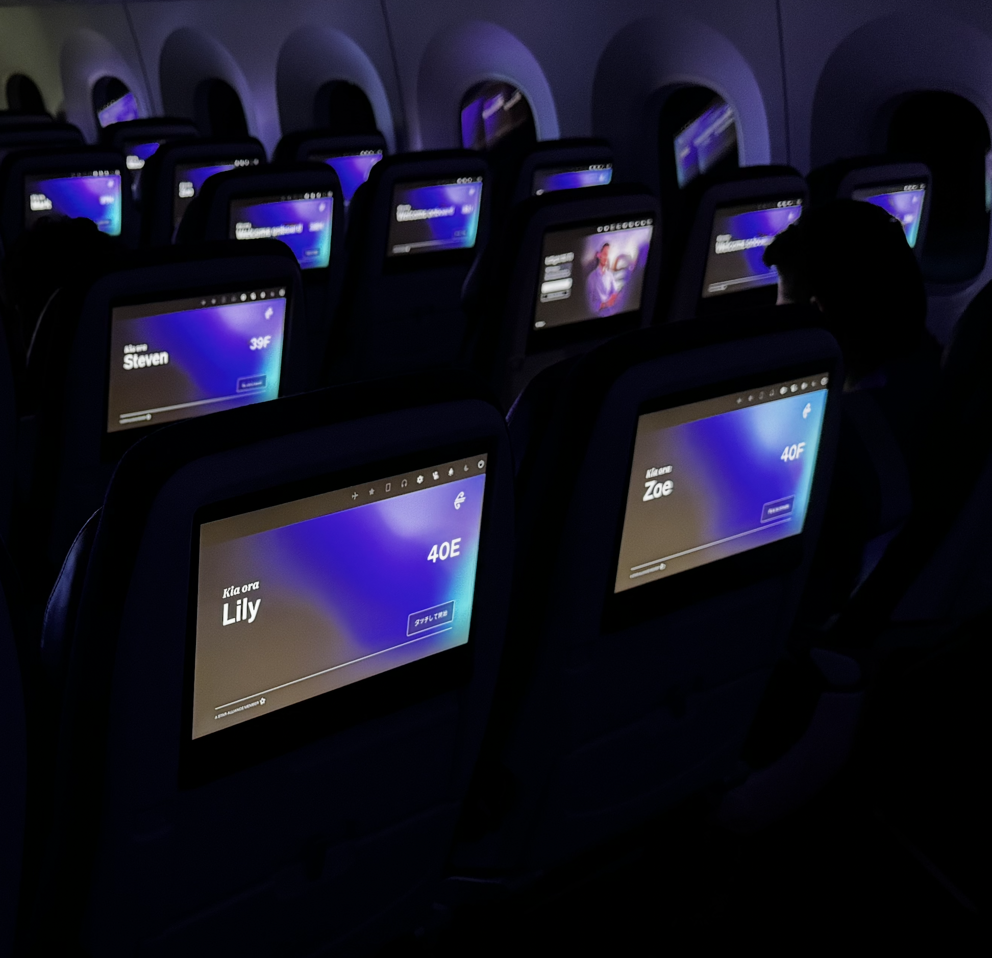
Reach: 152,491+ passengers, 7 aircraft & ongoing
Responsibility: UX Design, UI Design, Interaction Design, Prototyping, Storytelling, User Testing, Art Direction, Image Manipulation & Retouching, Content Creation
Team: PO, PM, Solution Architect, Software Engineer, Business Analyst, QA, Vendor, 3D Artist,
IMPACT
The big numbers
CSAT 82%
CSAT score post-launch a +3.4 point uplift.
152,491+
152,491+ passengers reached to date.
7 aircrafts
7 aircrafts being shipped. 15 more on the way.
5 web apps
Designed and shipped five web apps from 0 to 1
CONTEXT
A system shift
The previous system was six years old.
Locked to one vendor.
Every update required vendor to touch it.
Air New Zealand moved to a new vendor.
A configurable platform. A new set of rules.
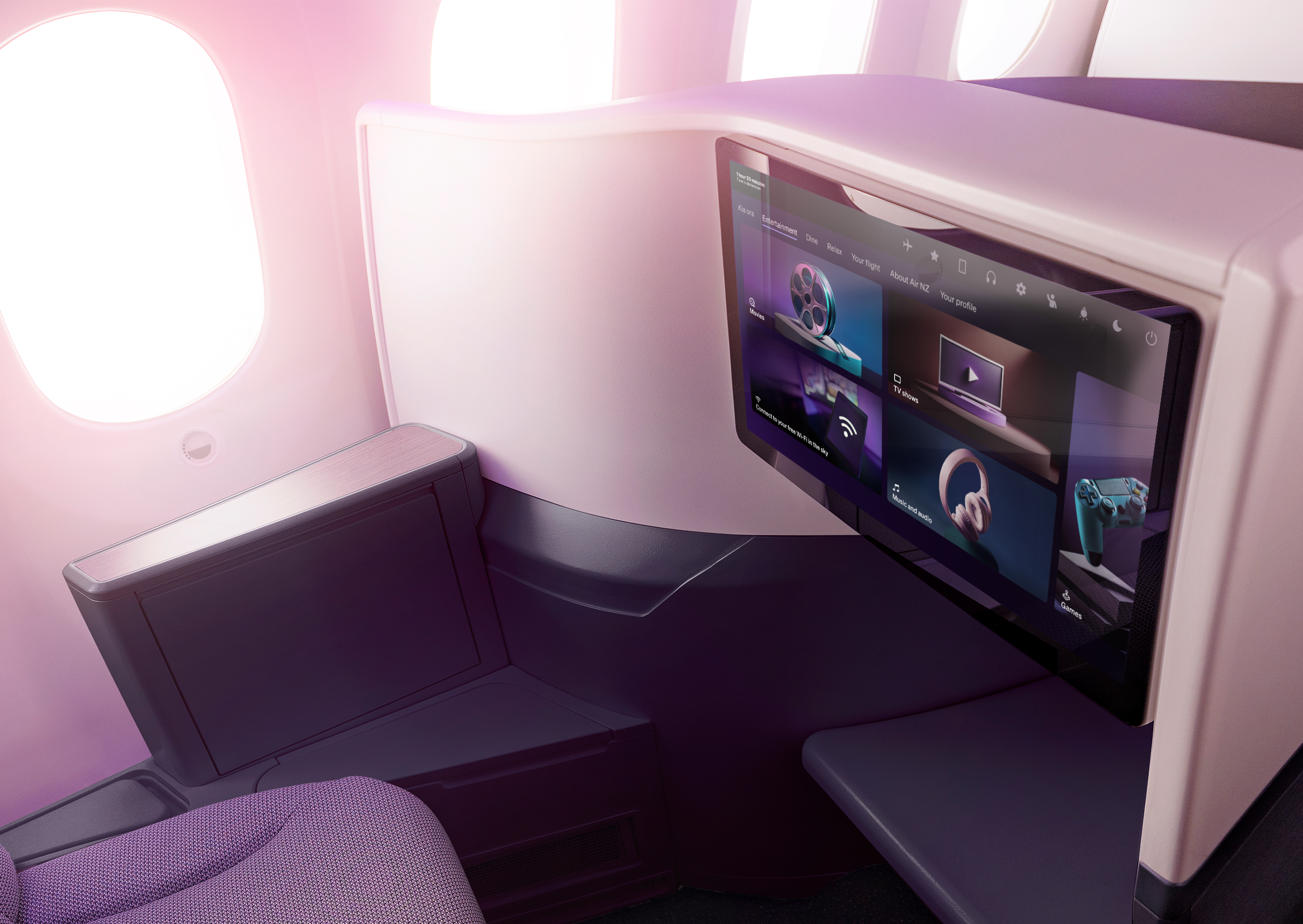
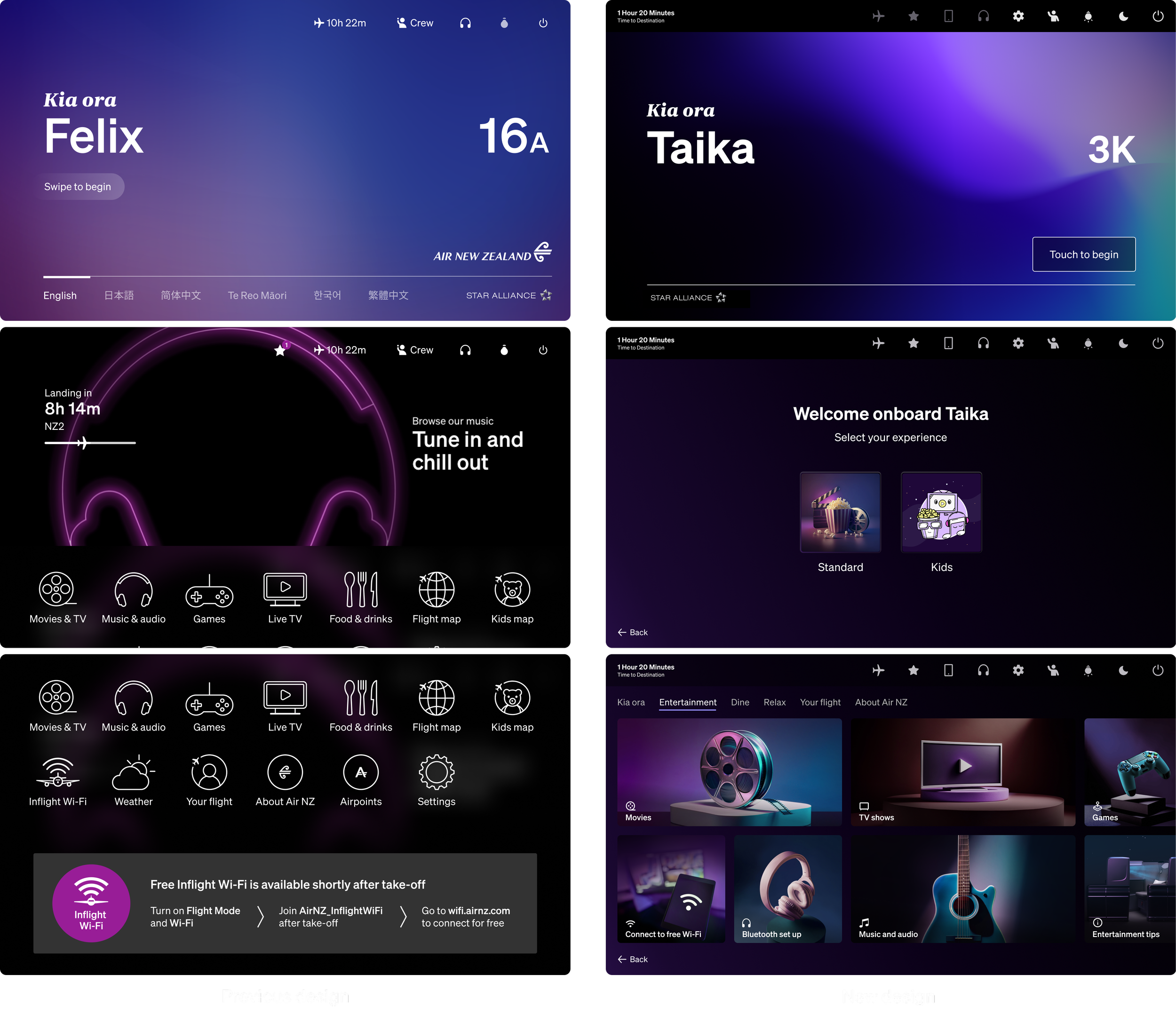
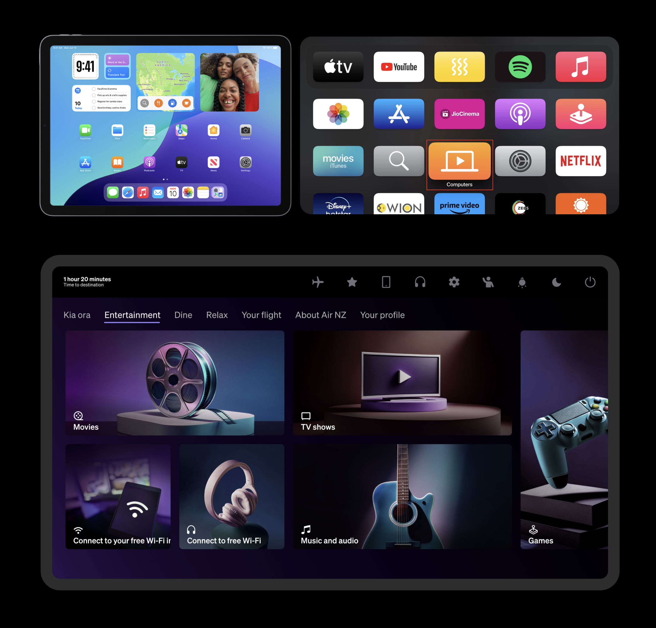
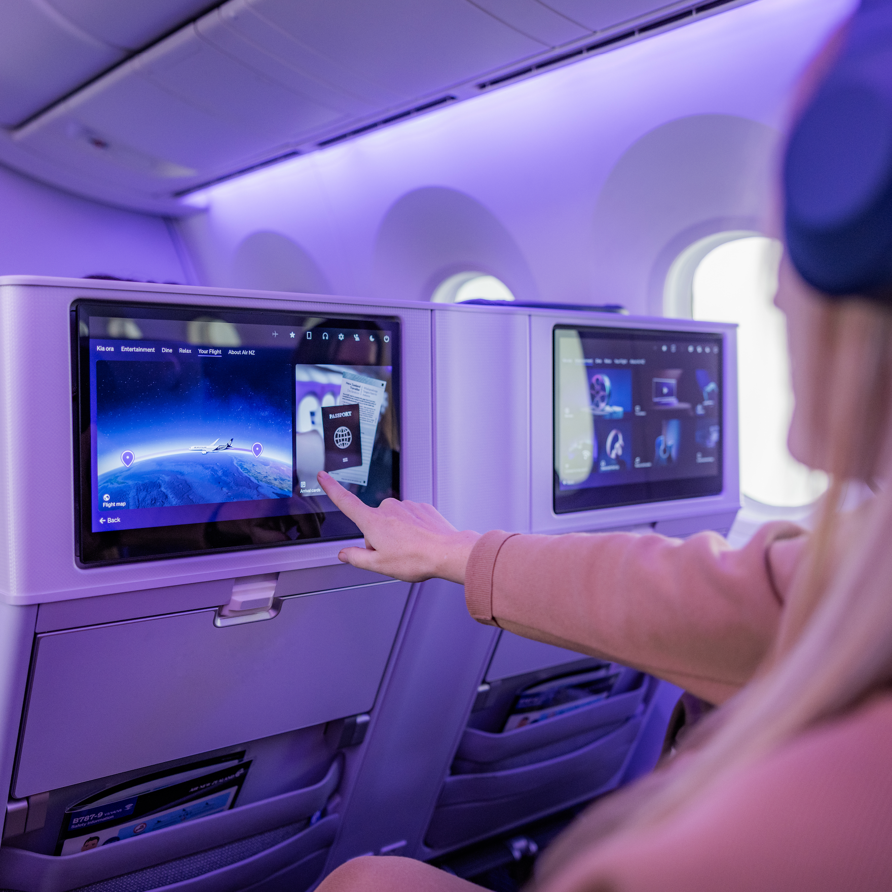
The key capability: container technology — the ability to deploy Air New Zealand's own in-house built web apps into the seatback screen.
A first for any airline.
But the new hardware unlocked more than that. Passengers could pair their phone as a media remote. Connect their own Bluetooth headphones. Make the seat feel like theirs.
This wasn't a redesign.
It was a new foundation.
PROBLEM
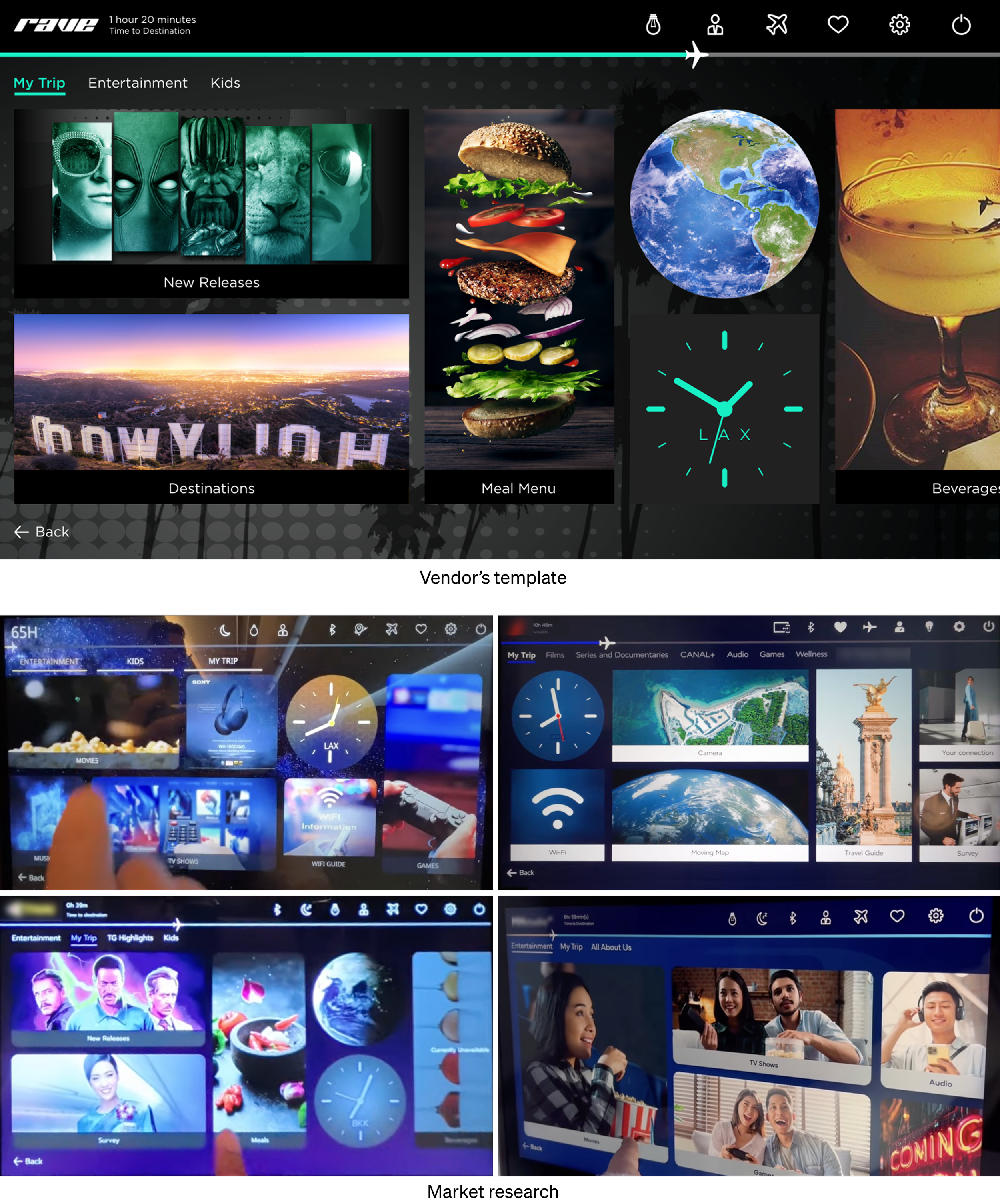
Vendor controlled system
Most airlines treat IFE as a content problem.
More movies. More music. More choice.
The screen delivering it?
Left to the vendor's default.
We asked a different question:
“What if the experience of using it
was as good as what was on it?”
That meant working within the vendor's constraints but
not against them. Finding every degree of freedom.
Pushing each one as far as it could go.
The result is unmistakably Air New Zealand.
CONSTRAINT
The reality
Post-COVID budget.
Hard launch date.
One designer.
So I became whatever the project needed
UI. UX. Art direction. Motion. Content.
AI-generated 3D. Dev handoff.
Every hat. One head.
Not because it was the right way to do it.
Because it was the only way to do it.
And we shipped.
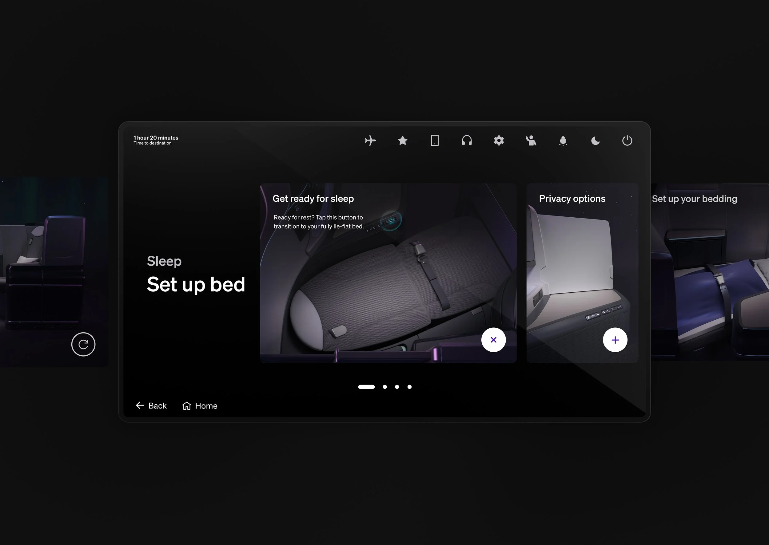
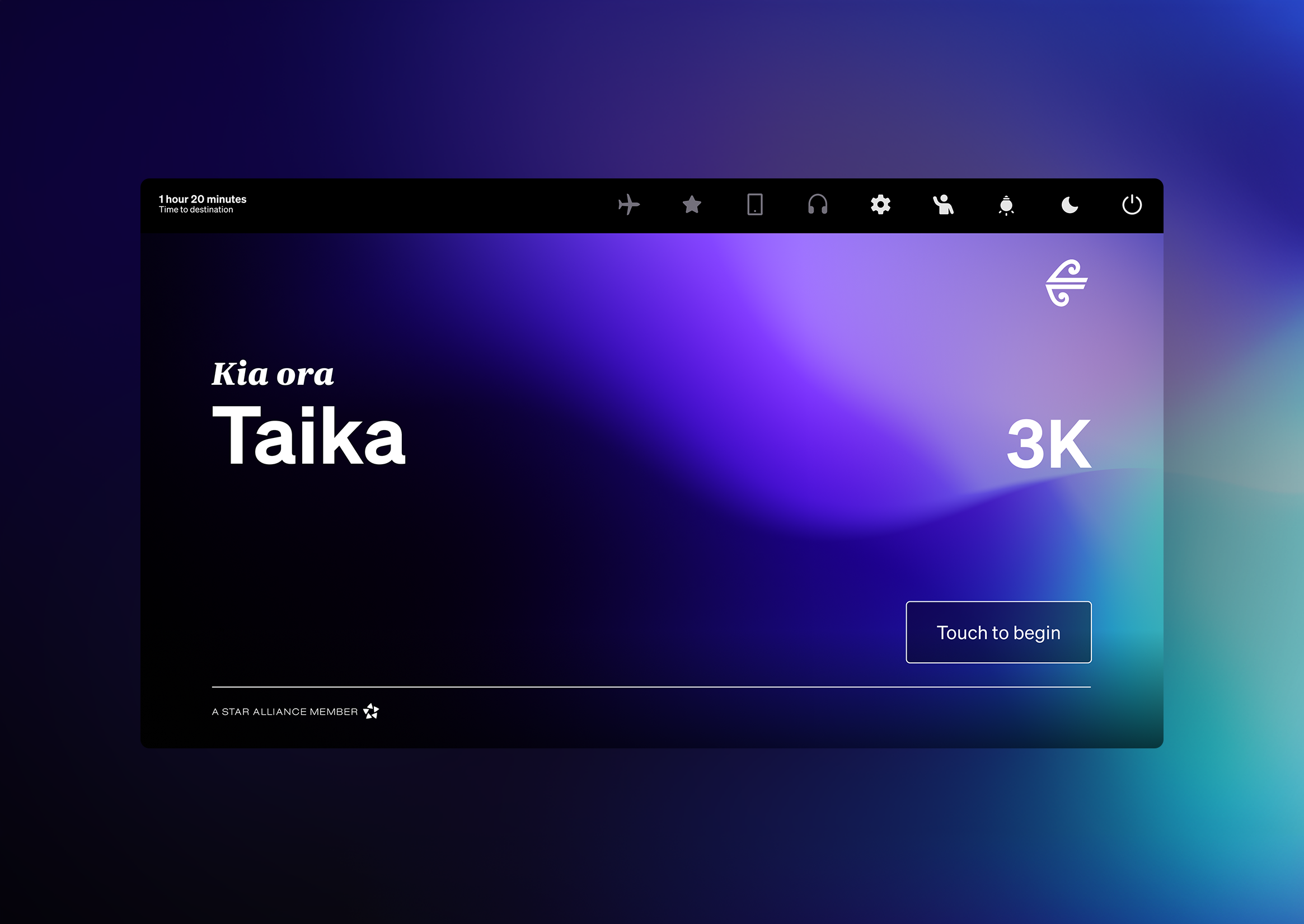
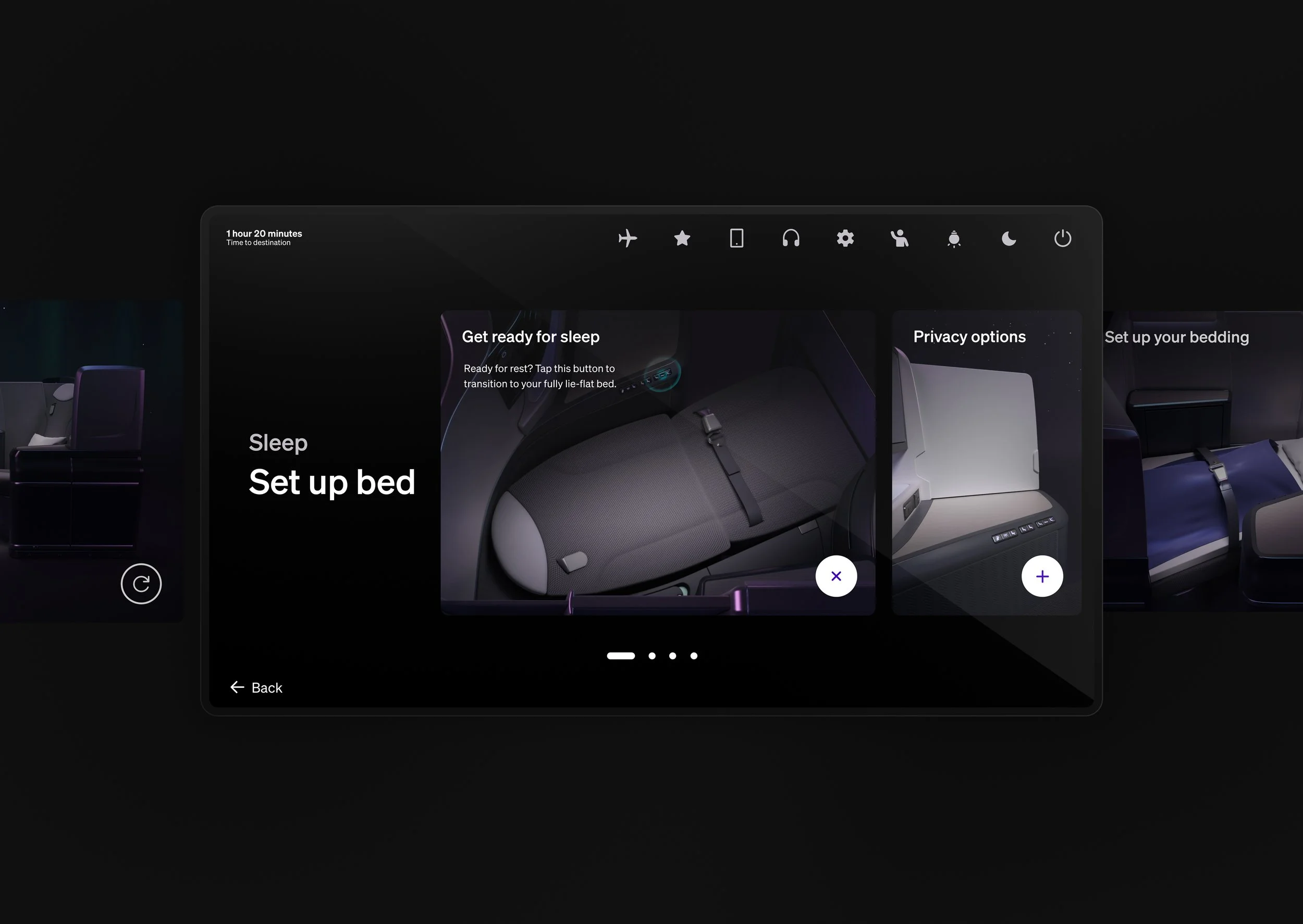
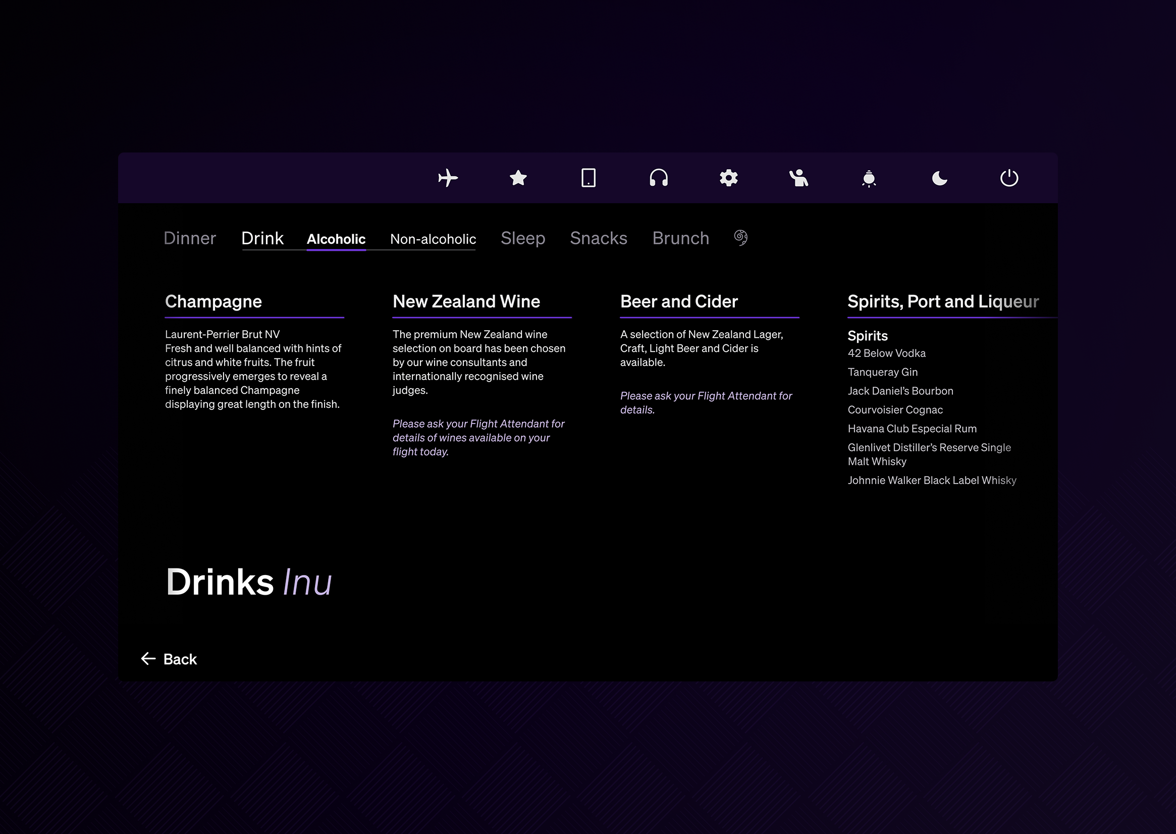
PRINCIPLES
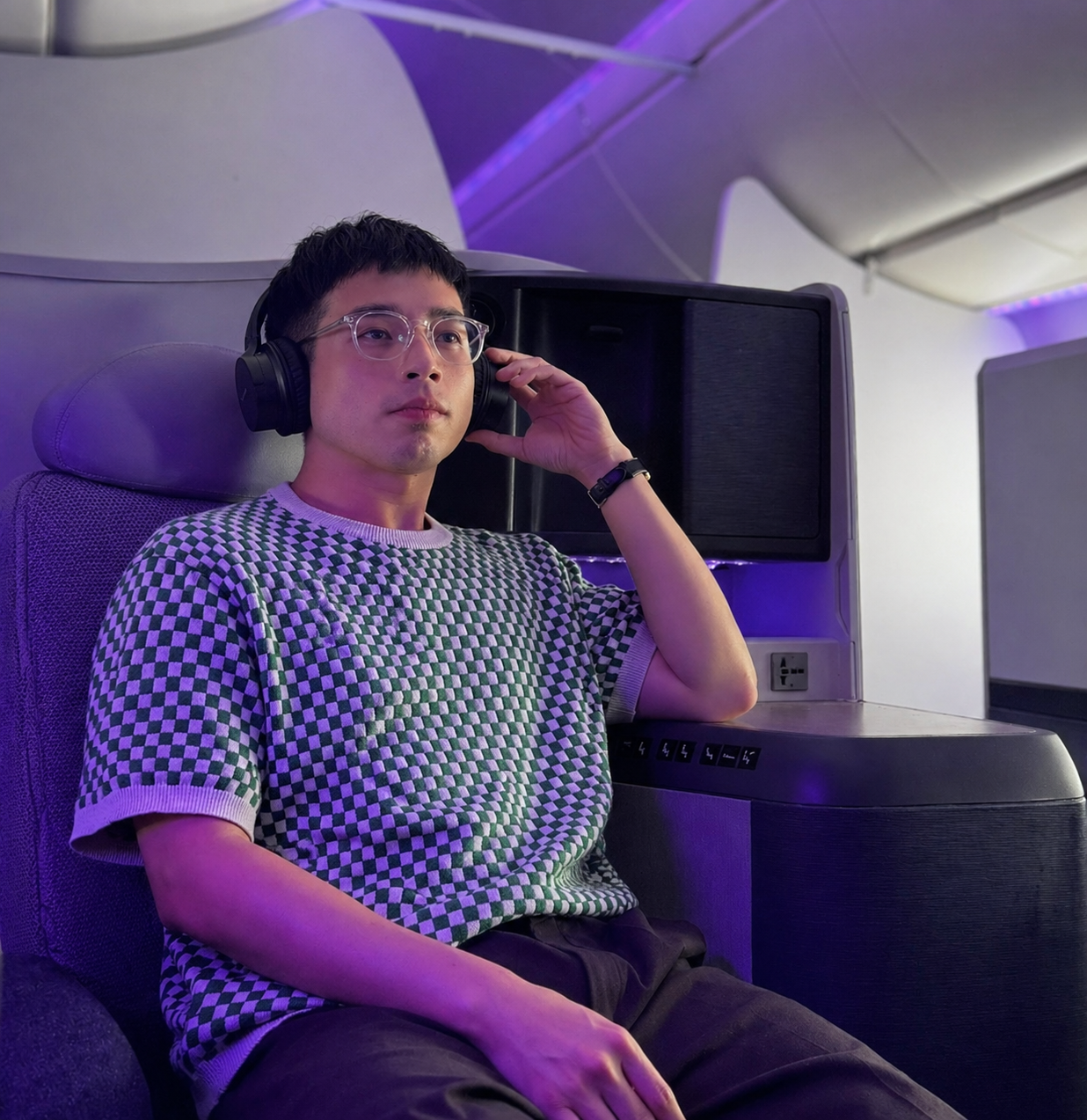
Designing for 38,000ft
-
Familiarity
IFE may look like a tablet,
but it behaves more like a TV.Passengers are browsing, relaxing, and settling in, not completing tasks.
Design for lean-back behaviour. -
Reach
Interaction happens from reclined seats, extended arms, and varying distances. Precision is reduced.
Larger text, touch targets, and forgiving layouts reduce effort.Design for relaxed interaction.
-
Attention
Attention is limited in-flight.
Every extra choice adds cognitive load.Clear hierarchy and obvious actions reduce friction.
Design for low mental effort. -
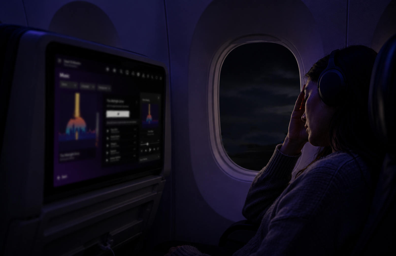
Atmosphere
Cabin environments introduce darkness, glare, movement, and distance.
Dark mode reduces eye strain and limits screen glare in dim cabins..
Design for the cabin environment.
-
Comfort
Passengers experience flying differently. Some are anxious, fatigued, or motion sensitive.
Motion should feel intentional, never decorative
Design with restraint and care.
CRAFT
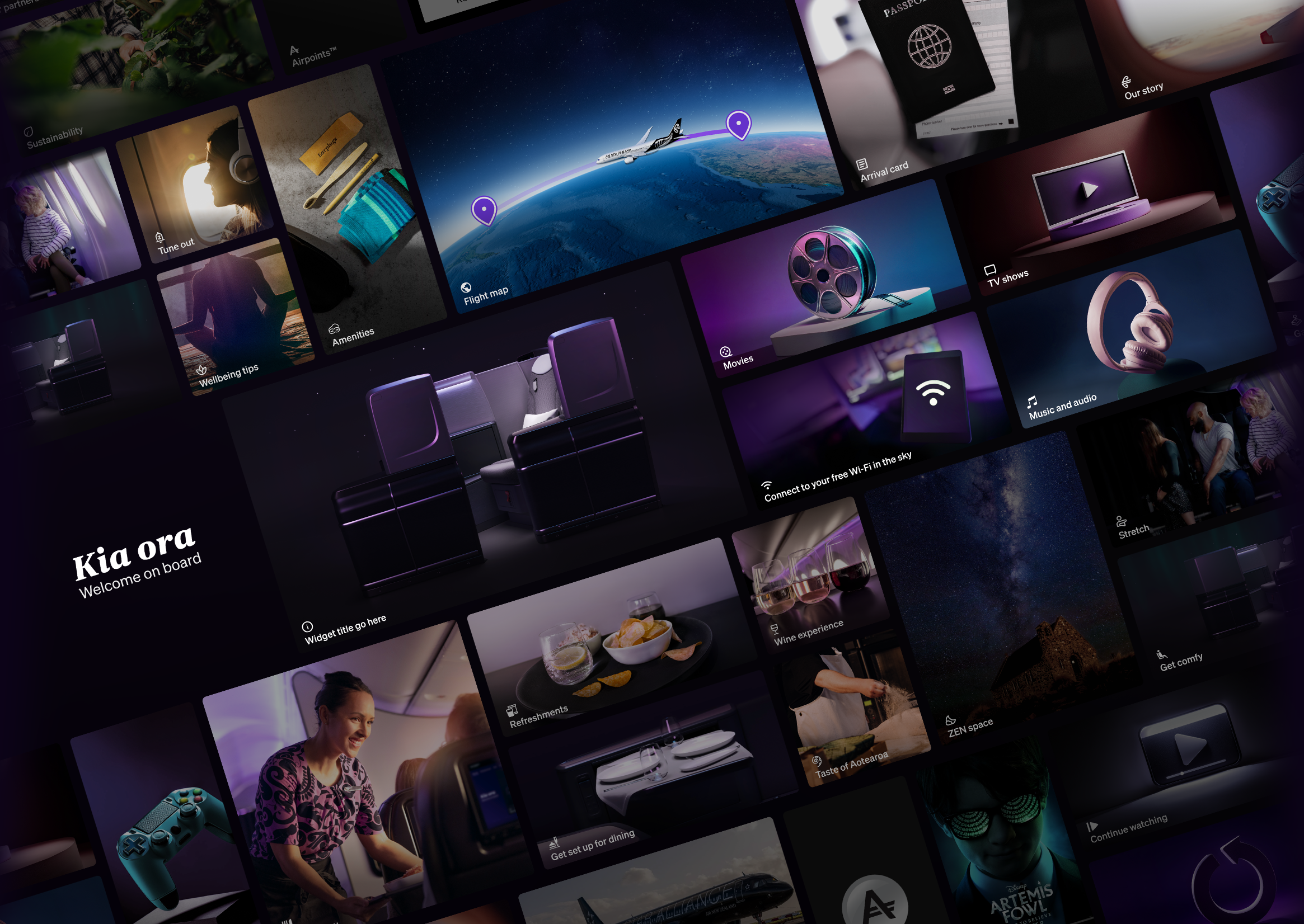
Visual Direction
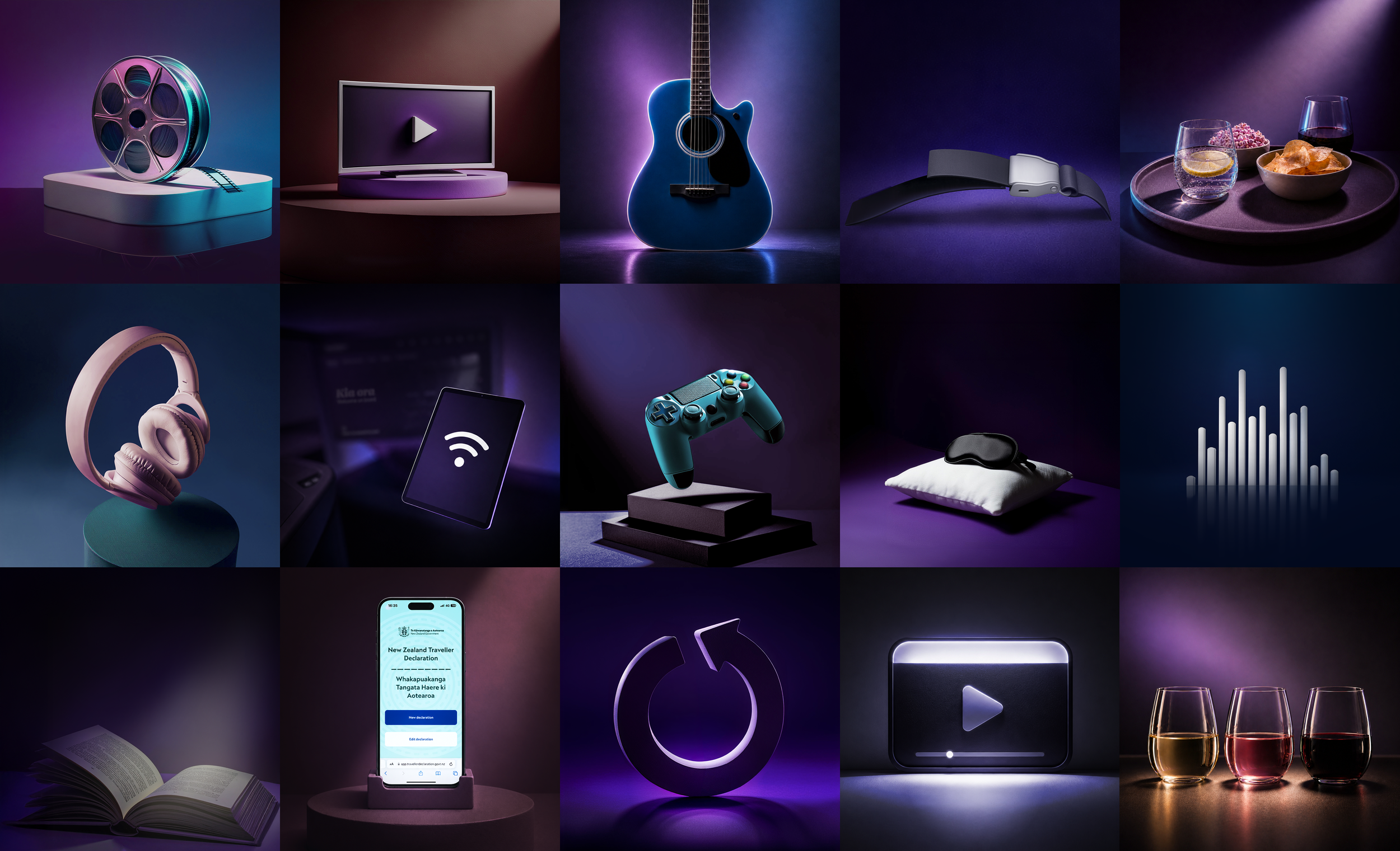
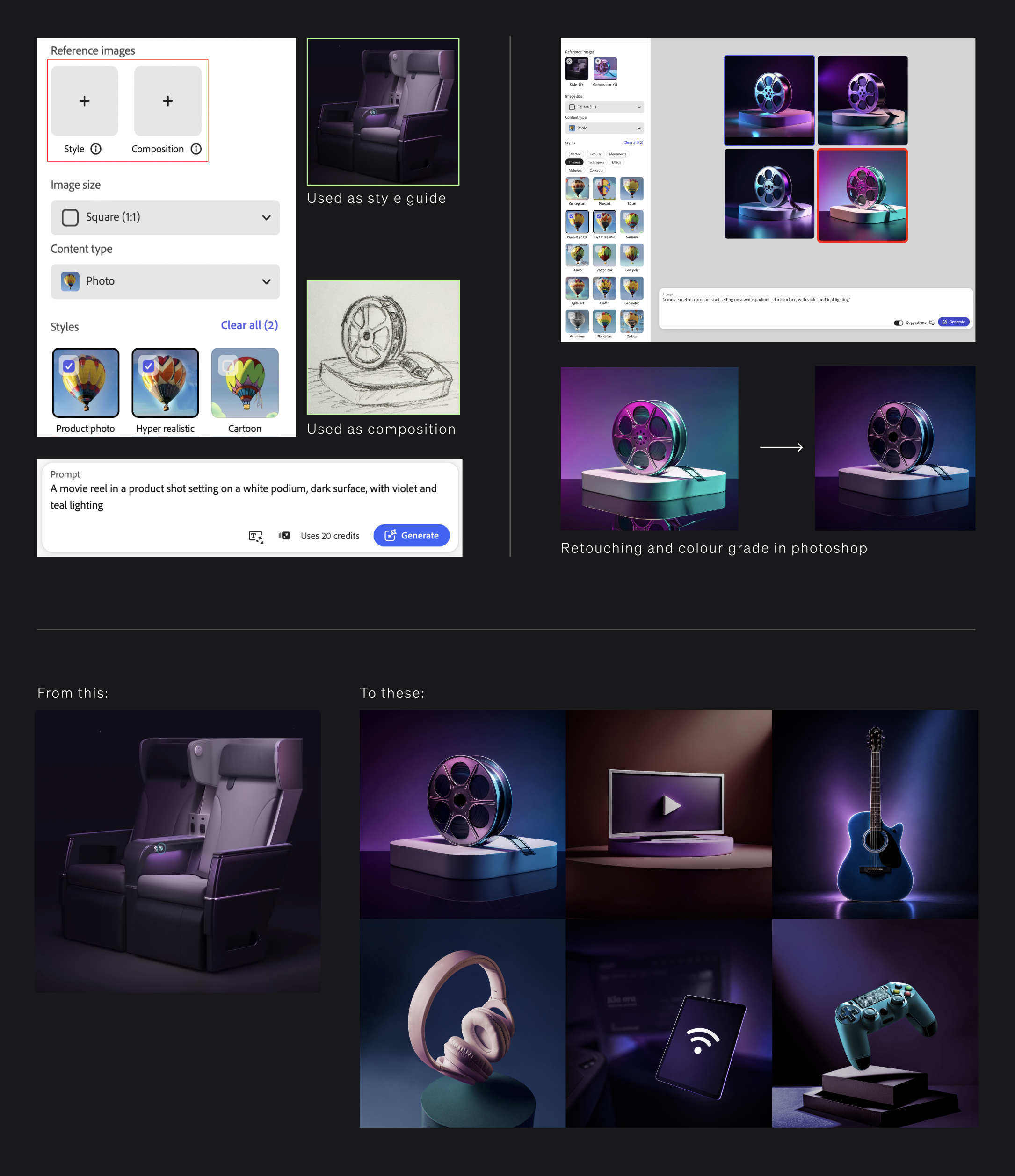
ART DIRECTION
Designing an evergreen visual system
No movie posters.
No album covers.
No celebrity imagery.
Just a problem
The content needed to remain timeless, scalable, and reusable across the platform. There was no budget for a dedicated 3D artist or large-scale photoshoots.
So I built the visual system myself.
Using early Adobe Firefly workflows, photography references, compositing, and extensive Photoshop retouching, I created a library of reusable visual assets designed specifically for the cabin environment.
The result became the visual signature of the onboard experience.
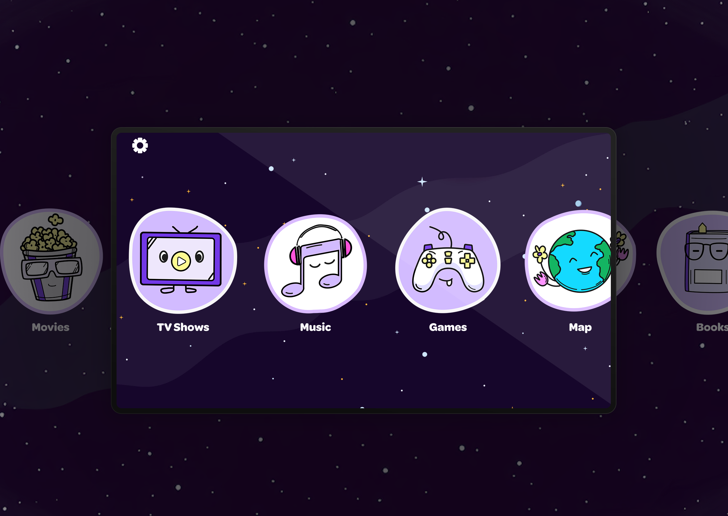
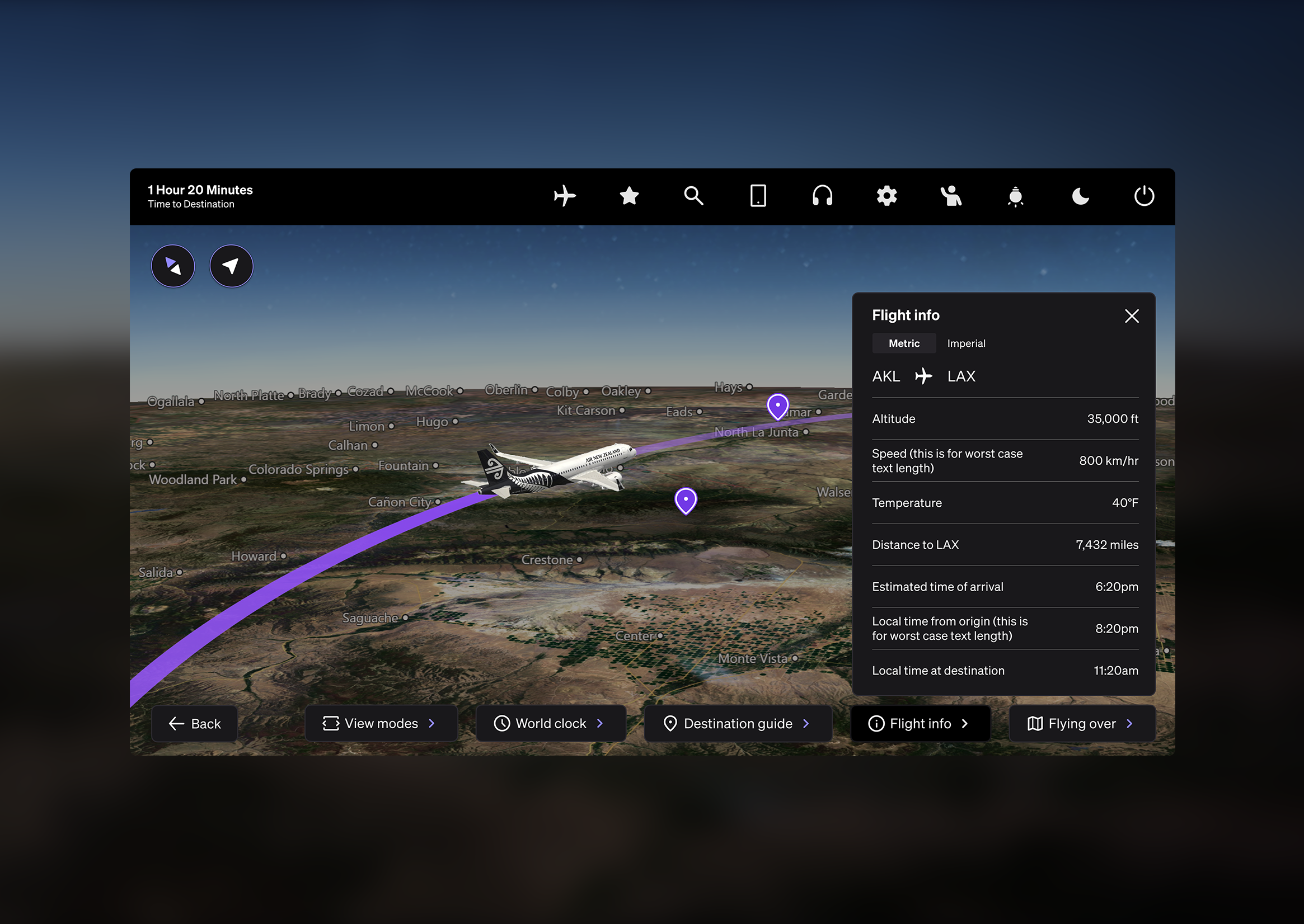
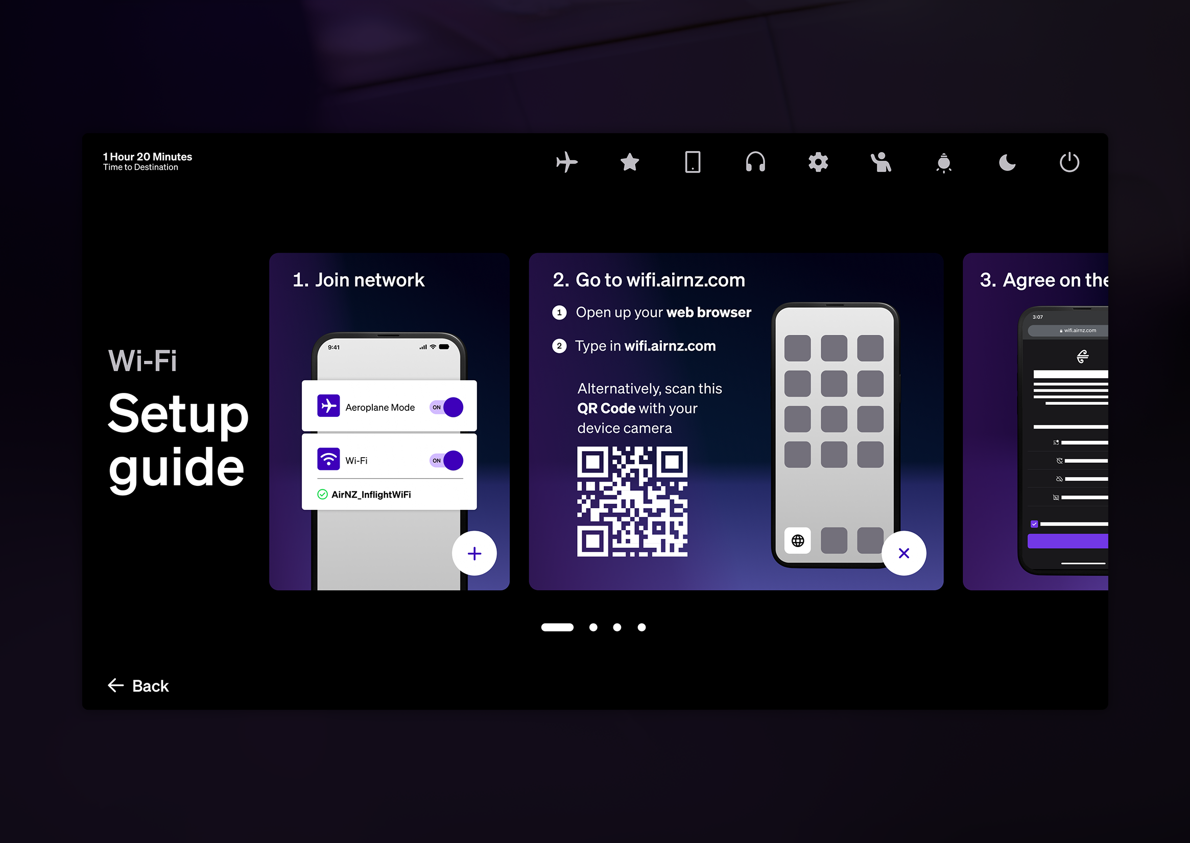
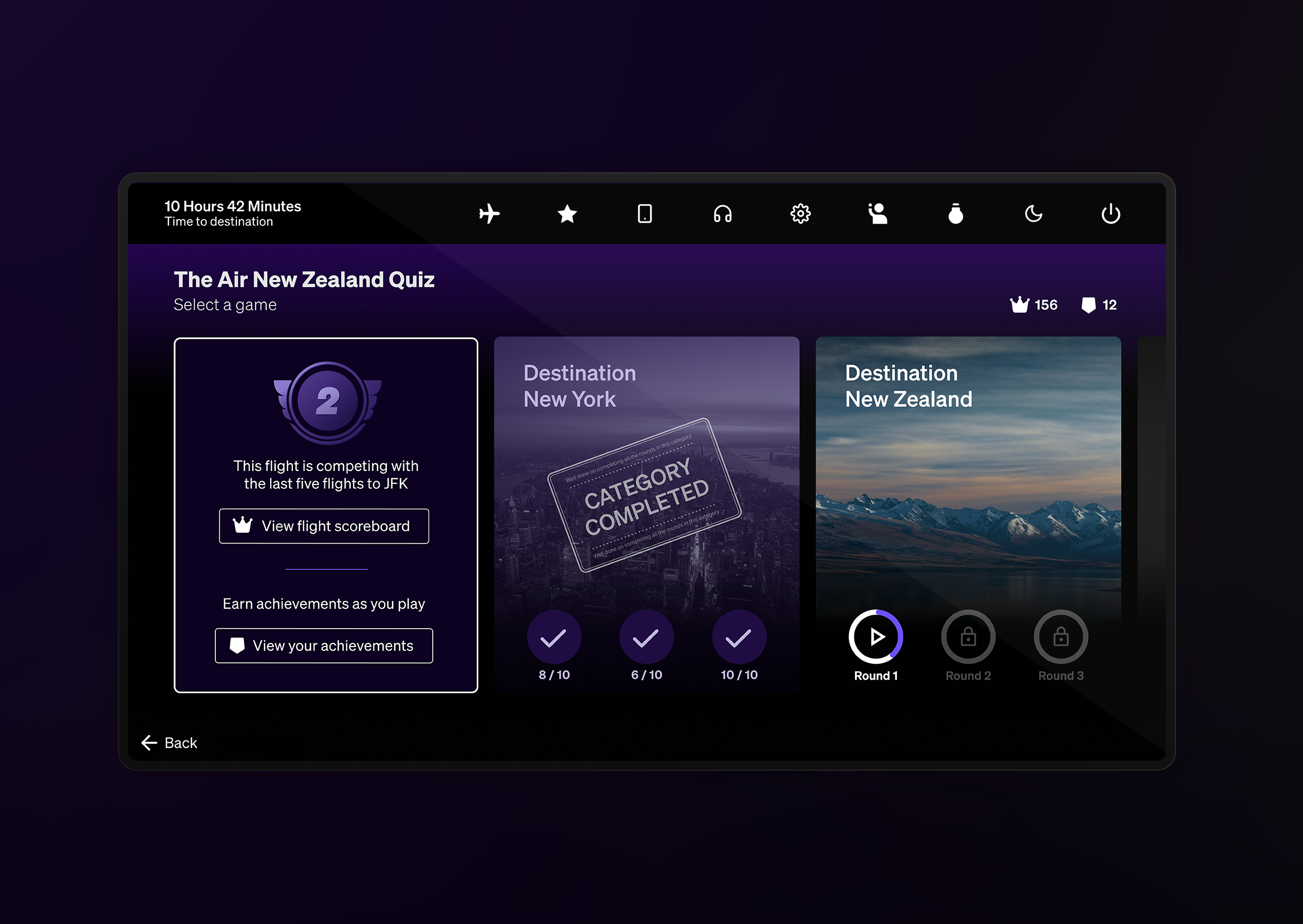
ECOSYSTEM
Beyond the seatback
The new platform unlocked something the old one couldn't.
The ability to deploy Air New Zealand's own web apps onto the seatback.
So we did.
Five of them.
Dining. WiFi. Quiz. 3D Map. FAMIL.
Different functions. Different users. Same screen.
Web apps deep dive coming soon…
IMPACT
What it earned
Inside the company
The IFE was singled out by the former CEO, Senior Leadership Forum, and National Sales as a standout element of the onboard experience.
The visual direction I built for the home screen was adopted by Brand Strategy as the reference standard for similar work across the wider Air New Zealand fleet.
The FAMIL app, one of the five connected apps has won 🥈 Silver at the Best Design Awards NZ.
Across the industry
Other airlines began asking the vendor how we'd done it.
The platform we shipped on now points to ours as the example.
❝ You need to ask
Air NZ for the hacks. ❞
– Safran SPI, to other airlines who wanted what we had
❝ IFE was a real highlight on the flight.❞
— Former CEO, Air New Zealand
REFLECTION
Final thought
Constraints don't limit good design.
They sharpen it.
Working inside a system I couldn't change pushed me to find precision where others would have accepted the default.
That's the job.